How did co-design workshops help us design a better database for affordable housing advocates?
Users felt more ownership which led to more participation and pride in the outcome.
Aug 2019 - May 2020
Enterprise Community Partners supports affordable housing by creating solutions, providing capital, and helps community development.
In Atlanta, there are many groups working towards similar goals in affordable housing. Community activists and non-profits, civic institutions and government employees, private companies and investors. They all had their own datasets and sharing was difficult, which meant no one had the full picture.
To make things more difficult, they didn’t always see eye-to-eye and agree on how affordable housing should be created and sustained.
Goals
Atlanta’s affordable housing advocates were fragmented. People were sending large datasets via email, and collaboration was hindered because there was no central place for people to access data. This meant that advocates were oftentimes working without the full picture or were slowed down by data requests.
Our goals were:
Launch a brand new product for affordable housing stakeholders to access and share data within a year.
Foster collaboration between groups working on affordable housing in Atlanta.
Build more trust between Enterprise and its stakeholders.
My Role
I led UX design, UX research, participatory design workshops, and visual design.
Over the course of 4 months, I collaborated with Kaylin Broussard to design and develop a participatory design workshop and begin our research plan. This included user interviews, SME interviews, and competitive analysis. I personally led the workshop consisting of 40 people.
Once I had created high-fidelity designs after our first iteration, I led 3 usability studies to get feedback and iterate, as well as recurring critique with other UX designers throughout the design process.
I worked alongside two engineers — 1 front end and 1 back end for development. I collaborated with my engineers frequently to talk about technical lift, as well as created a design library of colors, typography, components, flows, and annotations for production to launch. This included error states, loading states, and more.
Throughout the project, I presented designs to our Senior Director in design reviews to align on direction and make sure we were meeting our business goals.
Process & Work
Because this work was non-profit based and funded by local government as well as investors associated with affordable housing, community input and collaboration between affordable housing advocates was a major metric.
Aside from launching the database itself, we were also measuring success based on feedback from our community stakeholders: did they feel like they had a voice? Did they feel like we engaged with the community?
Because strengthening collaboration between groups was a core goal, I decided to use participatory design as our methodology. Participatory (co-design) has been shown to be effective in creating grassroots community impact and cohesion.
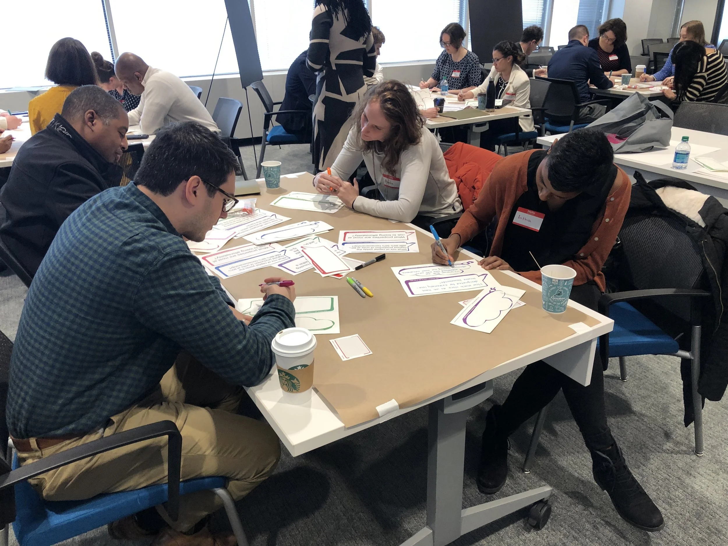
I proposed a workshop where participants were mixed between each other to foster collaboration and conversation.
The basic premise of the workshop is to answer this question: “What if you could just talk to the database? What would that conversation look like?”
The conversation was split into 3 parts:
What is a question you want to ask the data, and why?
What goals do users have, and what are the underlying intention of these goals?
In this activity, users would individually write down their question and why, and then the group would gather and present it. The group would then vote on each others’ questions, which helped us prioritize what would fit the need of the diverse participants.
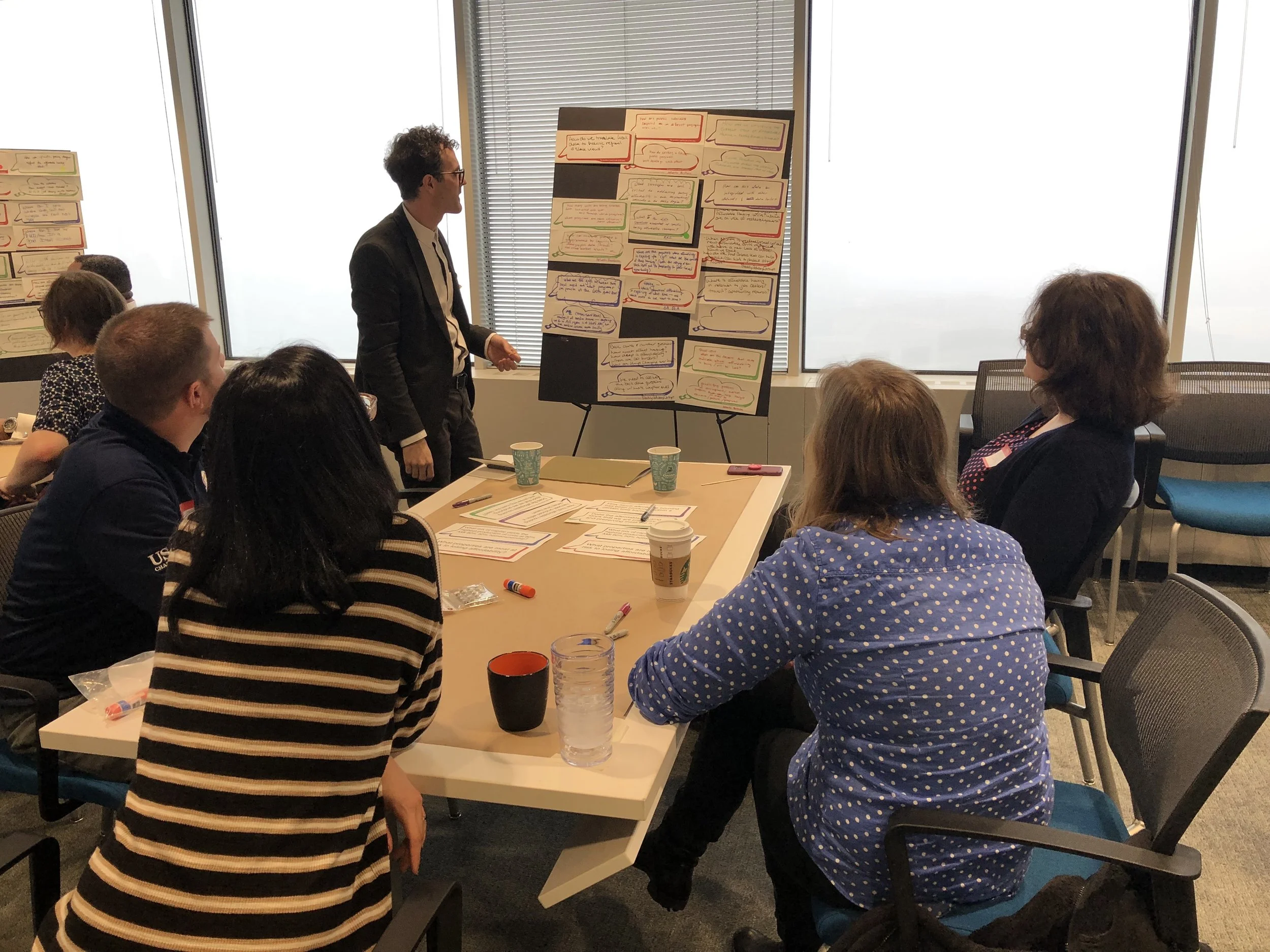
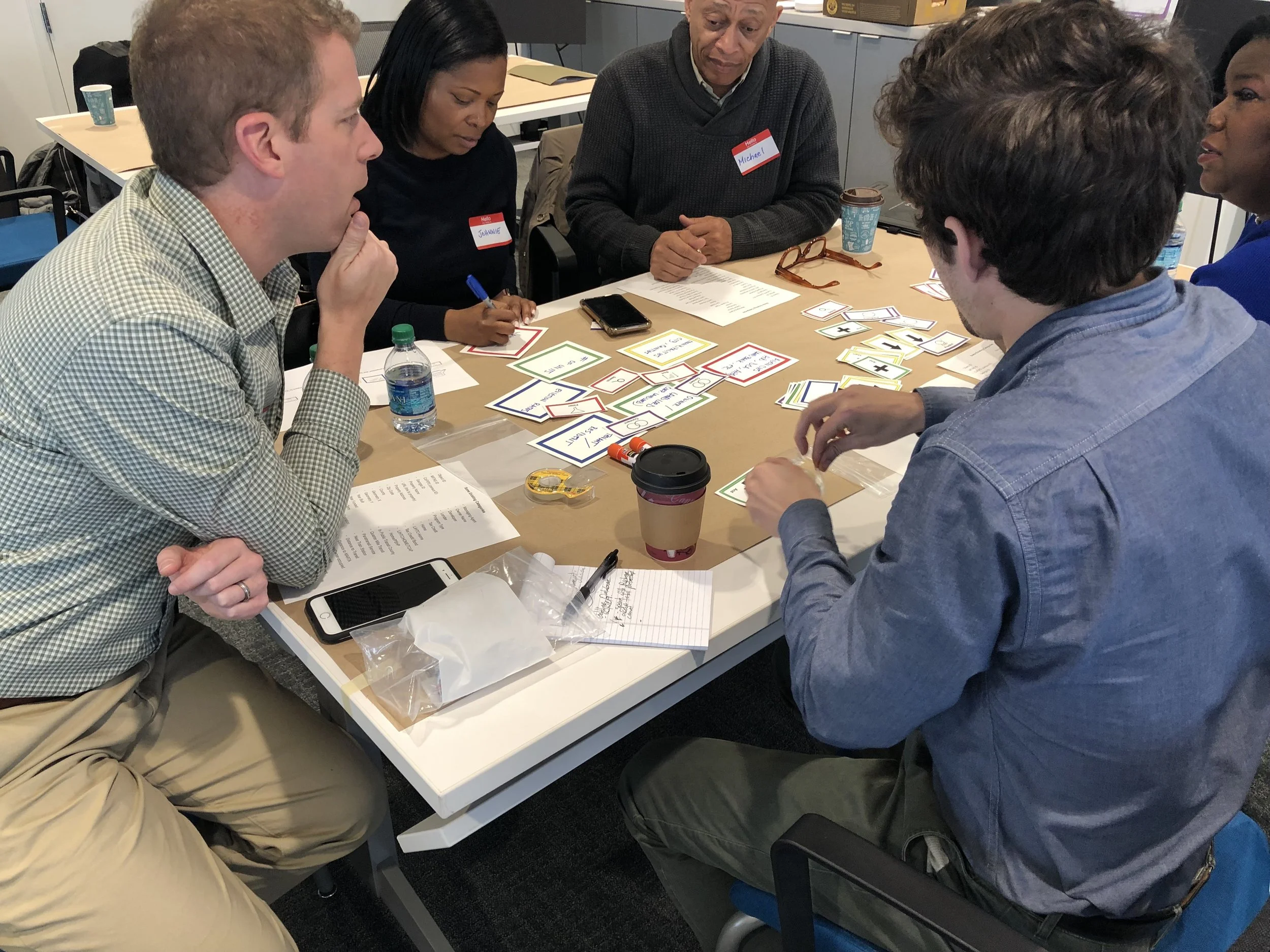
How would you translate it to something the computer can understand?
What actions would users actually take to interact with the data?
Here, users would build out queries with building blocks based on the question with the most votes. This helped us understand how they expected to interact with the system.
What would the data say back to you?
What channels and what were users expectations of what they would see once they submitted their query?
Participants chose from a number of templates and then sketched, wrote down, or drew what the outputs they expected the query to return.
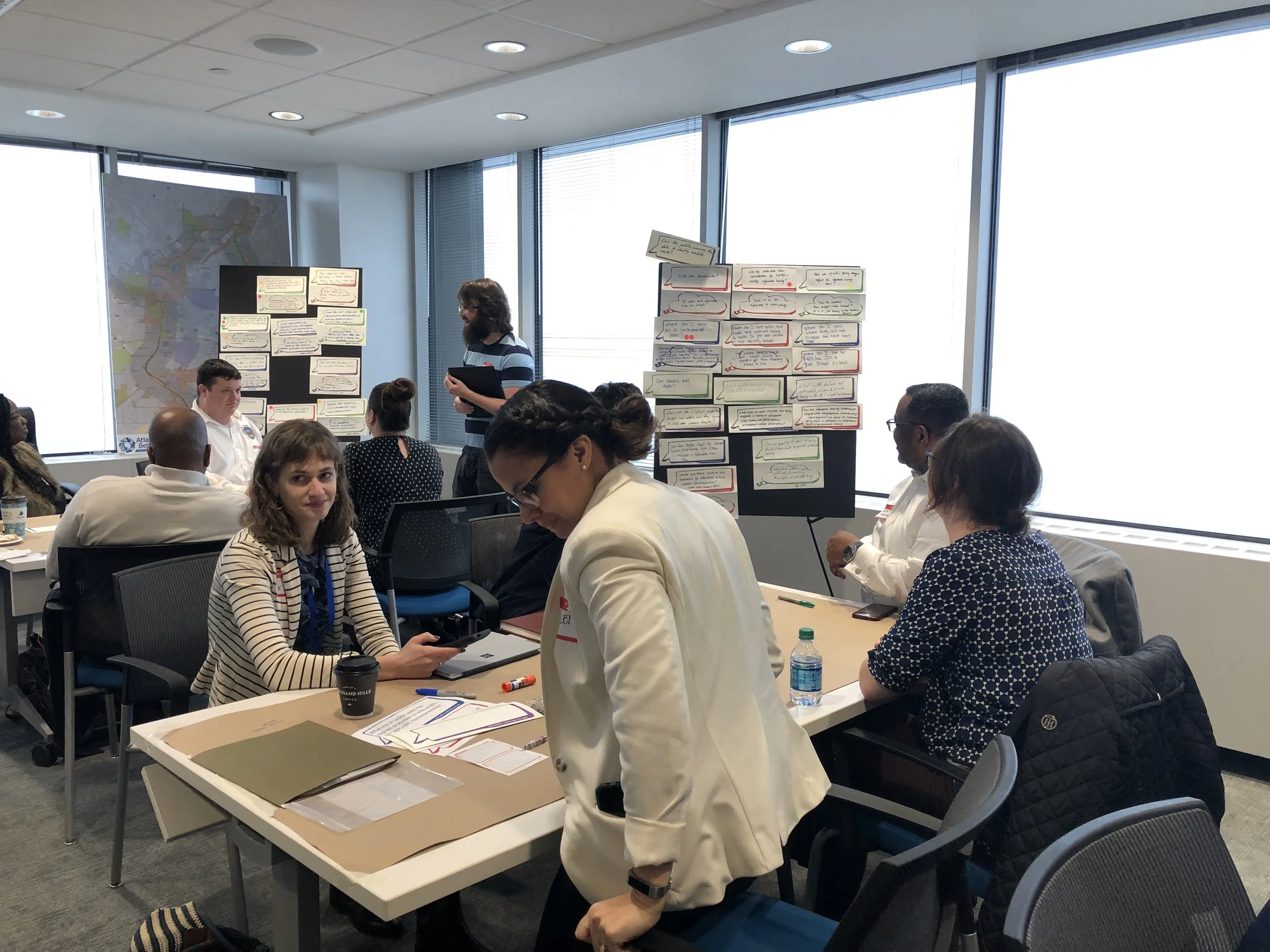
With 40 people attending the workshop, we had plenty of data to go through. Throughout the workshop, we noticed collaboration between many people who had never met.
They had lively conversations about their work, they made connections and talked about how they could help each other, they shared their contact information to keep in touch.
The workshop was a major success in helping us both gather data and meet our secondary goal of increasing conversation and collaboration.
Once we gathered the data, I analyzed the output for user needs based on themes, feasibility, priority.
We knew from the data that:
People were interested in filtering and flexibility. Because of the diversity of groups, people were interested in different things. The design should afford for flexibility in getting what you needed.
Mapping was important to see geography, and users were particularly interested in integrating with other datasets.
Dashboards of aggregated data were important to see the landscape of affordable housing across all datasets.
Downloading raw data was important in case individual analysis was needed.
With my research output, another designer created wireframes. Using this first iteration of the designs, I created Invision prototypes to test with users and present with our Senior Director.
From there, I made high-fidelity mock ups for production.
Mapping was important to show geographically which areas are more affected. Because of our diverse participants, I also wanted to show overlays based on census tract data that we had from our partners. These overlays help tell an even clearer spatial relationship to questions people had:
Where is Atlanta losing the most units in relation to rising rents?
How does income or race interact with affordable housing?
Do affordable housing units exist near amenities that are necessary for other affordability indicators, such as public transport?
Overlays with other spatial data help paint a clearer picture of affordable housing.
The raw data is what drives all the work behind affordable housing. Access to this data was important so that each organization or person can vet the information inside the database, as well as perform any other complex analysis they needed to do.
This view also provided previews of filtered data — an important part of making sure you’re looking at the right information on the map.
A snapshot view allowed for easy export for data to be used in presentations, something that came up surprisingly often in our workshop.
Snapshots also help more people access the data — not everyone is a savvy analyst who can handle the large amounts of data. This helped others in the room, such as community activists, to be able to deal understand the data more clearly.
As we drew closer to launch and the engineers wrapped up the backend architecture, I documented our design library and created in-depth specifications, flows, and annotations for how everything would function.
I worked together with engineers in design reviews and 1:1s to work through technical lift and understand where trade-offs would be made.
In May 2020, we launched the first production iteration of the HouseATL Affordable Housing Database.
Outcomes
The participatory design workshop was a major success. The whole workshop lasted 3 hours but it flew by for participants. Many remarked on their way out that it was one of the best work mornings they’ve ever had, and so many new connections were created. We were successful in our goal of creating more conversation and collaboration between these different groups of advocates.
We met our launch goal and the Senior Director of Enterprise Community Partners Southeast remarked how much of a success it was and that the response was very positive. Atlanta now has a unified database of affordable housing data for everyone to pull from, and it’s still updated today and accessible for everyone.
“That was the best morning in a long time. It was so fun but I also felt so productive. I can’t wait to see this thing happen and come to life. It’s going to really make our lives easier.”
More of my work: